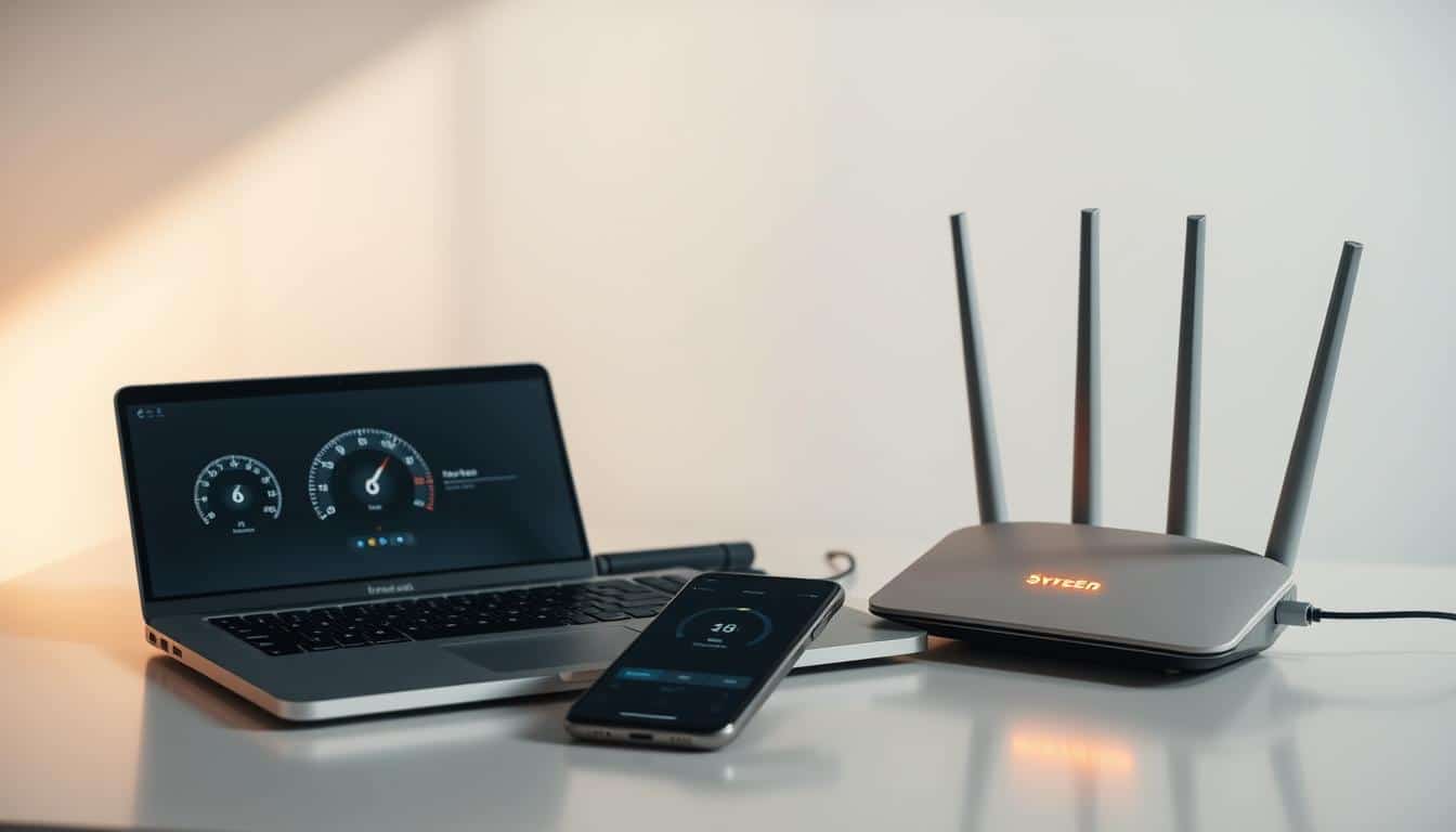
Staring at bright screens all day can hurt your eyes. This guide will show you how to turn on dark mode on various devices and apps. You’ll discover what dark theme is, its benefits, and how it’s different from night mode and blue-light filters.
Anúncios
If you’re looking to switch to dark mode on Windows, macOS, Android, or iOS, we’ve got you covered. We’ll also talk about making Gmail and Instagram easier on the eyes. Plus, we’ll dive into browser extensions and adjustments for better viewability. And we’ll tell you when a light display might be the better choice.
Key Takeaways
- Dark mode reduces glare and can cut eye strain for many users.
- Learn how to enable dark mode on major systems: Windows, macOS, Android, and iOS.
- Understand the difference between dark theme and night mode or blue-light filters.
- Use app and browser settings for consistent dark mode across services.
- Combine dark mode with accessibility tweaks for the best results.
Why Dark Mode Matters for Eye Comfort and Health
Switching to dark mode can make your eyes feel better during long times in front of the screen. In rooms that are not well-lit, dark backgrounds with lighter text make the screen less bright. This often helps reduce glare. Making the text bigger and increasing the contrast can also make things more comfortable.
Anúncios
Reduced eye strain and glare
Dark backgrounds lessen the bright white light that hits your eyes. This can cut down on glare and make your eyes less tired. Yet, how well this works depends on where you are. In bright places or with small text, dark themes might make reading harder.
Eye care experts suggest using dark themes with big, clear text. This usually makes reading easier and more comfortable.
Benefits for light sensitivity and migraines
For those sensitive to light or who often get headaches, dark mode might help. Using screens that are less bright and easier on the eyes can help with migraines. Yet, everyone is different. Some people find bright themes with high contrast better. Try both to see what works best for you.
Potential impact on sleep and circadian rhythm
Dark mode makes screens less bright but doesn’t filter out blue light that affects sleep. Use it at night to help you wind down. Pairing it with tools like Night Shift on Apple or Night Light on Windows can improve sleep quality.
Using dark mode at night along with blue-light filters can improve your sleep pattern. It helps your body follow its natural sleep cycle.
How to enable dark mode?
Dark screens help with eye strain and can make working at night easier. This section explains display options and shows how to change themes on different devices. Learn how to turn on dark mode for desktops, laptops, tablets, and phones. You’ll also get tips on the best times to use dark mode.
Overview of dark mode vs. night mode
Dark mode uses dark backgrounds and light text to lower bright light and glare. Night mode, called Night Shift on Apple and Night Light on Windows, reduces blue light. It does this by shifting colors to warmer tones. Both features aim to make screen viewing easier and can work together.
General steps that apply across platforms
To switch to a dark theme, start in Settings. Look for options like Appearance, Display, or Personalization. Then choose Dark theme or Appearance. Many apps also let you switch the theme in Settings. For quick changes, use Control Center on iOS, Quick Settings on Android, or Action Center on Windows.
For app-specific dark theme steps, update the app first. Newer versions usually support dark mode better. If there’s no theme option, use browser extensions or reader modes for a dark background.
When to switch and when to stick with light mode
Use dark mode at night, in dim rooms, or if bright screens hurt your eyes. Choose light mode for daytime work, reading long texts, or tasks requiring accurate colors. Try different settings to see what’s easiest to read. You may also combine themes with accessibility features as necessary.
| Scenario | Recommended Display | Quick Action |
|---|---|---|
| Late-night browsing | Dark mode with reduced blue light | Enable dark theme steps in system settings and turn on Night Shift/Night Light |
| Photo editing or color work | Light mode for accurate colors | Use calibrated monitor and keep ambient lighting neutral |
| Office daytime tasks | Light mode for readability | Use window blinds or monitor hood to reduce glare |
| Low-vision or sensitivity to glare | Dark mode with high contrast text | Adjust text size and contrast in accessibility settings |
Enable dark mode on Windows and macOS

Turning your desktop’s look to dark mode can reduce glare. This makes working for long hours easier on your eyes. Here, you’ll find simple steps to activate dark mode for Windows and macOS. There’s also a troubleshooting guide for common issues.
Windows offers different steps for enabling dark mode, depending on the version. With Windows 10, activate the dark theme and turn on Night light to cut down blue light in the evening. Windows 11 has a dark mode too, with a quick toggle in the Quick Settings for easy access.
For Mac users, setting the dark mode is straightforward in System Preferences or System Settings. You can pick Auto to switch based on the day/night cycle. Night Shift reduces blue light automatically, and many Mac apps will match the system’s dark or light setting.
Steps for Windows 10 and Windows 11
Windows 10 dark theme:
- Open Settings > Personalization > Colors.
- Choose Dark under Choose your color.
- Activate Dark app mode for apps that support it.
- To lessen blue light at night, go to Settings > System > Display > Night light.
- In Microsoft Edge and Office, set themes separately. For Office: File > Options > General > Office Theme.
Windows 11:
- Go to Settings > Personalization > Colors and select the Dark option.
- In Quick Settings, there’s a slider for brightness and a toggle for themes.
- Remember, while many apps follow the system theme, some might need individual toggles.
Steps for macOS (System Preferences / System Settings)
macOS (pre-Ventura):
- Navigate to System Preferences > General > Appearance and pick Dark.
- To change colors at dusk, turn on Night Shift under System Preferences > Displays.
macOS Ventura and later:
- Open System Settings > Appearance to choose Light, Dark, or Auto.
- The Auto setting changes the appearance based on the time of day.
- A lot of Mac apps will sync with the system’s look, but some allow for personal adjustments in their settings.
Troubleshooting common desktop issues
Some older apps or websites might not work well with dark mode. Try using high-contrast settings or browser extensions for a forced dark theme. This can help when needed.
If text or elements are hard to see, tweak contrast or choose different accent colors in the settings. Increasing text size or enabling bold text also helps make content more readable.
Lacking dark mode options could be due to old drivers or system versions. Make sure your graphics drivers are up-to-date and install any system updates. If you’re on a work computer, your company’s IT might need to change appearance settings for you.
| Platform | Quick Path | Blue Light Tool | Notes |
|---|---|---|---|
| Windows 10 | Settings > Personalization > Colors | Settings > System > Display > Night light | Enable Dark app mode; Office and Edge have separate theme options |
| Windows 11 | Settings > Personalization > Colors or Quick Settings | Settings > System > Display > Night light | Quick toggle for theme; some apps need their own theme switch |
| macOS (pre-Ventura) | System Preferences > General > Appearance | System Preferences > Displays > Night Shift | Most apps follow system appearance; some app prefs allow overrides |
| macOS (Ventura+) | System Settings > Appearance | System Settings > Displays > Night Shift | Auto mode switches with time of day for automatic dark switching |
Turn on dark mode in popular mobile apps and OS
Dark screens on phones reduce glare. They make apps easier to read at night. Both Android and iPhone have options to turn on dark themes for many apps. With just a few taps, you can switch most interfaces to a darker look. This not only saves battery on OLED screens but is also easier on the eyes.
Android system dark theme
For Android 10 or newer, go to Settings > Display > Dark theme. Or, swipe down to Quick Settings and tap the Dark theme icon. Android 13 introduces Material You, affecting dark accents with wallpaper colors. Most apps will automatically use the Android dark theme. If not, look in the app’s settings for Theme, Display, or Appearance options for a dark mode.
iOS dark mode toggle
On an iPhone, go to Settings > Display & Brightness and select Dark. Or, use the Control Center for a quick change. Long-press the brightness control to switch between Light and Dark. You can set it to change automatically with Sunset to Sunrise or a custom time. Also, try Night Shift to reduce blue light in the evening.
Dark mode in common apps
Many apps let you change themes easily in their settings. For Facebook, go to Settings & Privacy > Display & Accessibility and choose Dark Mode. Gmail has a Theme setting for applying a dark theme or following the system’s default.
Twitter (X) has a Display option under Settings and privacy for Dark mode. Instagram usually matches your device’s theme. However, some Androids allow you to set a theme in the app’s settings under Theme or Display.
| Action | Where to find it | Notes |
|---|---|---|
| Enable Android system dark theme | Settings > Display > Dark theme or Quick Settings | Works system-wide; Android 13 adds Material You adaptive colors |
| Turn on iOS dark mode | Settings > Display & Brightness or Control Center (brightness long-press) | Set Automatic for sunset schedule; pair with Night Shift for blue light |
| Facebook dark mode | Facebook app: Settings & Privacy > Display & Accessibility | Choose On, Off, or System to match device theme |
| Gmail dark theme | Gmail app: Settings > Theme | Select Dark or System default to match phone settings |
| Other popular apps | App settings > Theme / Display / Appearance | Most apps follow the system; update apps if options are missing |
To use dark mode on a phone, keep the system theme dark and update apps. On OLED phones, true blacks save power and extend battery life. If an app’s dark mode option is missing after an update, check the app’s settings or Help for guidance on changing appearance.
Dark mode for browsers and websites
Turning your browser and websites to dark mode helps reduce glare. This makes long browsing sessions gentler on your eyes. Most browsers let you choose dark themes and settings that apply to many sites. For sites without a dark mode, extensions can help.
Enabling browser themes and extensions
In Chrome, you can select a dark theme under Settings > Appearance or from the Chrome Web Store. For sites that need it, Chrome has experimental features to force dark mode. In Microsoft Edge, simply enable dark theme in Settings > Appearance. Add-ons for Edge can be found in Edge Add-ons. Firefox allows you to pick a dark theme and customize colors in General > Language and Appearance.
Using website-specific dark modes and reader modes
Websites like YouTube, Reddit, and Medium let you switch to dark mode in the settings. Using site-specific dark modes ensures colors and design stay true. Reader modes found in Safari and Firefox remove distractions. They also let you choose comfortable color schemes for reading.
Best extensions and settings for consistent web dark mode
Extensions such as Dark Reader, Midnight Lizard, and Turn Off the Lights are great for customizing dark mode. They allow for site-specific settings and contrast adjustments. Choose extensions that respect your privacy, with good reviews and minimal permissions. When using browser extensions for dark mode, make sure to whitelist sites that require original colors.
- Start with native browser themes before adding tools.
- Create per-site exceptions for galleries and editing tools.
- Test changes on a few sites to confirm readability and color fidelity.
Adjusting accessibility and display settings for best results

Dark mode works best with the right accessibility and display adjustments. Small changes in text size, contrast, and color filters help. They reduce eye strain and make reading easier in dim light.
To make things look clearer, tweak your device’s display settings. Increase text size and spacing for better reading. For Windows, adjust text size in Settings. On iOS and Android, use Larger and Bold Text options under Accessibility. Designers should check their work at bigger sizes to keep everything readable.
Smart contrast choices
Stay away from pure white on black backgrounds. It’s too harsh and can tire your eyes. Choose softer tones like #E6E6E6 for text. Use gentle lines to separate content and ease visual strain. If you need clearer separations, turn on high contrast dark mode on Windows or macOS. This enhances readability without creating sharp contrasts.
Color filters and vision needs
Color filters benefit those with color vision issues or light sensitivity. Use Windows Color Filters, macOS, and iOS/Android Color Correction with dark themes. Testing these filters with real-life content ensures info remains easy to read and understand.
System-level accessibility features
Activate system-level features to improve dark mode. On Windows, use Ease of Access for text adjustments and color filters. macOS offers options to increase contrast and reduce transparency. Mobile settings provide color inversion and correction. These enhancements make dark mode better for everyone.
Custom themes and safe customization
Start with what’s already available before trying third-party themes. Many browsers and apps let you tweak their look with custom CSS or themes. Pick themes from trustworthy sources. Always test them for clear reading across different devices and lighting conditions. Graphic experts should ensure colors stay true on all screens and in print.
Practical checklist
- Increase text size and line spacing in Display & Accessibility menus to reduce strain
- Enable color filters dark theme options only after testing for legibility
- Try high contrast dark mode when low vision makes standard dark themes hard to read
- Soften pure white text with off-white tones to avoid halation
- Test custom themes across devices and ambient lighting before wide rollout
When dark mode may not be the best choice
Dark mode is a good fit for many tasks and dim environments. Yet, certain situations benefit from light text on bright backgrounds, as they make things clearer and ease the strain on our eyes. We’ll go over common cases, design issues, and quick fixes to switch modes for specific tasks requiring high contrast.
Long-form reading and light mode readability
When it comes to long reads, like articles, reports, or e-books, having black text on a white backdrop tends to aid quicker understanding and reduces eye fatigue in well-lit areas. People find it easier to remember what they’ve read when the display looks like printed paper. If you’re diving into heavy material for hours, try out both settings and lean towards light mode for those longer reading stints.
Bright ambient environments
In outdoor spots, brightly lit offices, or near powerful task lighting, light modes offer more contrast and decrease the need to squint. Glossy screens can make dark modes look washed out, turning icons and fine lines hard to spot. Knowing when dark mode falls short is key: switch to light themes for a clearer view in these scenarios.
Vision issues and readability
For folks with astigmatism or certain eye problems, dark mode might make text look blurry or create a halo effect. Testing both modes can help. If you notice text smudging or edges blurring, opt for light backgrounds. Don’t forget to bump up text size and contrast for better visibility.
Color accuracy dark mode
Designers and photographers, take note: dark interfaces might mess with how colors and contrast truly look. For accurate color work, stick to neutral, color-accurate light themes on calibrated screens. Make the most of tools designed to show how your work will look on client screens or in print.
Workflow tips to switch modes for design
- Switch design apps like Adobe Photoshop or Figma to light themes, even if your OS is set to dark mode.
- Adjust app-specific themes to prevent colors from looking off during image work.
- When checking your work, use a color-managed light setup for consistent colors.
Temporary high-contrast needs
Need to focus on spreadsheets, small UI components, or legal documents? Switching to light mode, even briefly, can enhance visibility. Keep quick-change options ready in your Control Center, Quick Settings, or browser toolbar. Using keyboard shortcuts or widgets can make these adjustments easier and keep your work flowing smoothly.
| Task | Recommended Mode | Quick Tip |
|---|---|---|
| Long-form reading | Light mode | Increase font size and line spacing for comfort |
| Outdoor work | Light mode | Raise brightness and disable dark themes |
| Photo editing and color proofing | Light mode with color-managed profile | Use calibrated monitor and preview tools |
| Low-light browsing | Dark mode | Enable blue light filter and lower brightness |
| Accessibility needs (astigmatism) | Light mode usually better | Test both modes and adjust contrast |
Tips to optimize dark mode for productivity and comfort
Dark layouts can ease your eyes and sharpen your focus if used correctly. Start with a few simple routines to enhance comfort and workflow. Here are practical actions to match display settings with your daily life.
Pair dark mode with blue light controls. On macOS, try Night Shift; on Windows, Night Light; or apps like f.lux work too. Schedule these blue light filters from evening till morning, aligned with your sleep habits. Dark themes with these tools can cut down glare, making nights more comfortable.
Test third-party palettes before committing. Find themes from trusted places like the Chrome Web Store or Mozilla Add-ons. Always check the app contrast to ensure it meets WCAG standards for text. Note these settings to easily revert if a theme causes issues.
Build a simple dark mode routine. Switch on dark mode after dinner or in low light, then use light mode when high color accuracy is needed. If you work nights, adjust the schedule to your sleep cycle. Let specific actions, like finishing dinner, prompt mode changes to build a habit.
- Use automation: schedule dark mode with system toggles or Shortcuts on iOS and Automator on macOS.
- Keep a backup: export theme settings or note steps to restore defaults if an update breaks a palette.
- Prioritize contrast: ensure normal text stays readable at a 4.5:1 ratio for accessibility.
For the best outcome, combine these dark mode tips with a set blue light filter schedule and select themes carefully. Small daily habits can make your setup effortless, keeping you comfortable throughout long working hours.
Conclusion
Dark mode helps lower screen brightness and glare, especially in low light. It’s good for those who are sensitive to bright screens, reducing eye strain at night. Using dark mode with accessibility features and blue-light filters enhances comfort during nighttime use.
To start using dark mode, update your devices and apps. Then, set a dark theme on Windows, macOS, Android, or iOS. Use specific settings for each app. For websites that don’t offer dark mode, add Dark Reader or similar extensions. Also, tweak text size and contrast for better viewing.
Test how dark mode works where you usually are, and set it to change automatically on your devices. But remember, use light mode for color-sensitive work or when reading a lot. Following these steps will make dark mode both comfortable and beneficial for your needs.
FAQ
What is dark mode and how is it different from Night Shift or Night Light?
Will dark mode reduce eye strain and glare?
Can dark mode help people with light sensitivity or migraines?
Does dark mode improve sleep or affect circadian rhythm?
How do I enable dark mode on Windows 10 and Windows 11?
How do I turn on dark mode on macOS and iOS?
How do I enable dark mode on Android and per-app themes?
Which popular apps offer dark mode and where is it located?
How can I make websites use dark mode consistently?
Which browser settings support dark mode?
What accessibility settings should I adjust with dark mode?
When is dark mode not a good idea?
How do I handle apps or websites that don’t support dark mode?
Can dark mode save battery life?
Any tips for combining dark mode with blue-light reduction and scheduling?
Are third-party dark themes and extensions safe to use?
How should designers and photographers approach dark mode?
What quick toggles or shortcuts can speed switching between modes?
How do I troubleshoot missing dark mode options or display problems?
Conteúdo criado com auxílio de Inteligência Artificial