The SHEIN app dominates fast fashion by mixing quick trends, many SKUs, and strong promotions with a mobile-first strategy. This article provides a focused shein ui analysis for U.S. readers. It explains how design choices boost conversion, discovery, and retention on a platform where mobile traffic drives growth.
SHEIN’s business model depends on speed. It uses fast design cycles, tight supply chains, and constant merchandising updates. This makes shein mobile ux decisions very important.
Advertisements
The app must show new styles fast, push promotions, and keep users scrolling without overload. These needs influence interface patterns, component choices, and interaction details. We will explore these aspects next.
Our shein ux design review studies public screens, common UX rules, and compares SHEIN with Zara, H&M, and Amazon. We also look at app store feedback and user behavior. This helps us guess analytics methods and A/B testing targets. Our technical views follow industry trends, not inside info.
The article has a nine-section plan. It starts here and moves to interface and mobile UX audits, design system and component work, home and discovery flows, navigation strategies, product page conversion tactics, and interaction and accessibility considerations. The last part covers the analytics and technology that support quick UI updates. Each section explains patterns, trade-offs, and useful tips for designers and product managers studying the SHEIN app.
Key Takeaways
- SHEIN focuses on mobile-first experiences as most users and revenue come from phones.
- High SKU counts and fast trends require balancing discovery with easy checkout.
- Our shein ui analysis uses public screens, app reviews, and best practices, not private data.
- Comparisons to Zara, H&M, and Amazon show where SHEIN prefers engagement and conversion over editorial depth.
- The article covers design system choices, navigation, product-page tactics, usability, and data-driven UI decisions.
Overview of SHEIN App Interface and Mobile UX
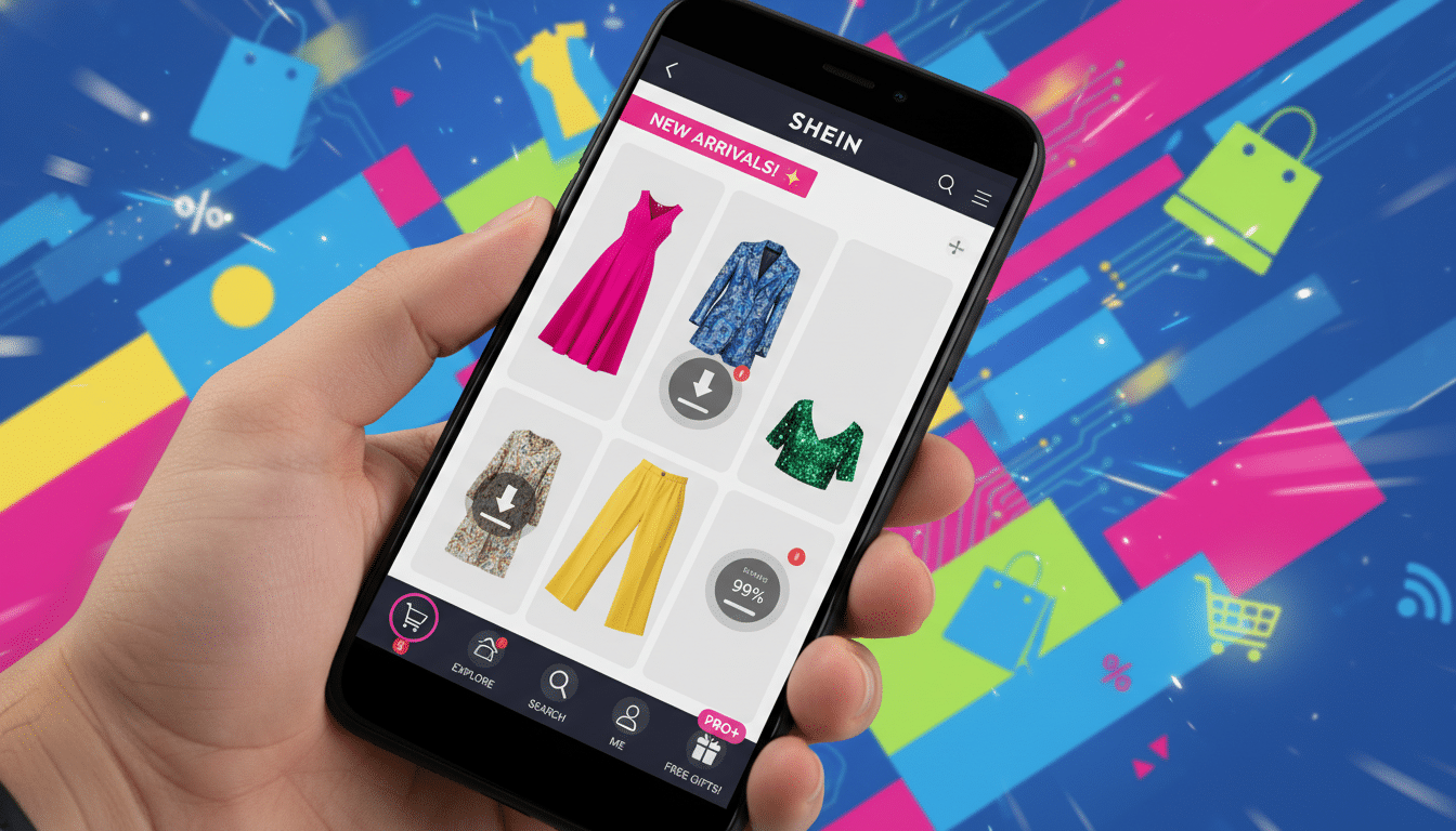
The SHEIN app interface blends fast-fashion energy with mobile-first practicality. On launch, users see an image-forward feed.
This feed highlights trends, promotions, and personalized drops. It sets the tone for shein ux design. It also guides how users discover and buy items.
Market context and target users for the SHEIN app
SHEIN target users are mostly teens through early 30s in the United States. They chase trends on tight budgets. These users respond well to influencer marketing and flash sales.
Constant new arrivals attract them. Global scale causes expectations to shift by region. But mobile convenience and low-price discovery stay constant.
Core goals of the app: conversion, discovery, and retention
The app’s UX drives conversion with clear CTAs and scarcity cues. It also uses streamlined checkout to boost impulse buys. Discovery happens through curated feeds and algorithmic suggestions.
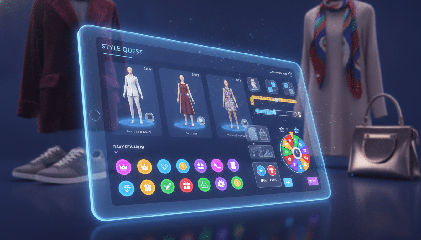
These suggestions surface novel items quickly. Retention uses push messages, coupons, daily rewards, and lightweight gamification. These increase session frequency and repeat purchases.
- Conversion metrics: conversion rate and average order value.
- Discovery metrics: click-through on recommendations and time to first purchase.
- Retention metrics: repeat purchase rate and session frequency.
How SHEIN balances fast fashion needs with mobile usability
SHEIN mobile UX balances large inventories with a clean experience. The app cuts cognitive load with prioritized CTAs and image-first layouts.
This lets users scan quickly. Progressive loading and smart defaults keep screens fast and focused. Designers use personalization to reduce choices.
Filters and sorting help shoppers narrow catalogs. Risks include clutter and decision fatigue. Strong filtering, clear labels, and predictable interactions keep users engaged.
Shein UX Design Principles and Design System
The SHEIN app uses a bold visual style with clear rules to keep browsing fast and familiar. Bright accent CTAs stand out against high-contrast product images. Compact typography helps dense catalogs stay easy to scan.
Consistent icons for wishlist, share, and cart create quick recognition across push notifications, in-app banners, and email. These visual choices support core UX goals: clear product focus, fast choices, and low friction paths to purchase.
Repeated cues reduce mental effort and speed decision-making on small screens. A steady brand tone builds trust. It also encourages users to explore and check out quickly.
Under the surface, a practical design system organizes building blocks for teams to reuse daily. Standardized buttons, input fields, product cards, and badges live in a shared library. A modular grid helps responsive layouts adapt smoothly from iOS to Android devices.
Design tokens control color, spacing, and type and serve as a single source of truth. They let designers swap palettes or tweak headings and spread changes across screens. This stops one-off components and shortens quality assurance cycles.
The design patterns focus on reusability and speed. Patterns for product lists, quick-add flows, and overlays are adjustable so engineers toggle variants without rebuilding UI. This cuts redundancy and speeds the path from test to production.
A mature design system helps features launch faster by easing handoffs between design, engineering, and quality assurance. Reusable components make A/B tests simpler. Local themes and skins apply with little code change, helping marketing launch promotions quickly.
From a UI analysis view, the result is predictable interfaces that scale well. Teams spend less time fixing inconsistencies and more time improving conversion factors. This builds a platform that supports rapid updates while keeping a unified brand experience.
Home Screen and Discovery Flow: shein app interface patterns
The home screen guides users through quick offers, seasonal pushes, and curated feeds. Visual hierarchy puts hero banners at the top to showcase major promotions and high-margin collections.
Below these banners, surfaced categories appear as tiles to speed browsing and reduce clicks.
Recommendation slots labeled “For You” or trending picks use algorithmic signals to increase discovery and time on app. These personalized carousels rotate based on behavior and inventory.
This nudges users toward items they might not find through navigation alone. The layout follows common shein design patterns that favor fast scanning and strong visual cues.
Hero banners, category surfacing, and personalized recommendations
Hero banners dominate screen space for launches and time-limited drops. They act as directional signposts linking to theme pages or campaigns.
Category surfacing places top categories within thumb reach so shoppers can jump straight to dresses, shoes, or accessories.
Personalized recommendation modules mix editorial picks with algorithmic suggestions. These modules prioritize items with strong margins or promotional status to meet business goals.
Small visual badges signal deals and urgency without breaking the browsing flow.
Search prominence and predictive suggestions
The search bar sits prominently near the top, encouraging direct queries. Instant suggestions show popular keywords, categories, and trending items as users type.
Predictive suggestions reduce friction by offering immediate options and lowering abandonment risk.
- Auto-complete entries mix brands, categories, and exact product matches.
- Recent searches and popular trends appear to speed return visits.
- Search results integrate filters early so users refine quickly.
Content-to-commerce integration: editorial cards and promotions
Editorial-style cards blend style guides, lookbooks, and influencer edits into the shopping flow. These cards inspire purchase intent by showing outfits and use cases, not just single SKUs.
Promotions layer on top with coupon badges and time-limited banners to create urgency.
Promotional overlays are prioritized by campaign weight and inventory. When combined with editorial content, they nudge discovery toward shoppable looks.
This fusion of content and commerce is a core part of the shein app interface. It ties into how the experience connects to the shein product page ux and broader shein navigation ux.
Navigation UX: shein navigation ux and menu strategies
The navigation layer controls how shoppers move from discovery to checkout. Clear choices and fewer taps improve conversion. This section covers menu placement, taxonomy, and user flows.
It focuses on practical patterns that increase engagement and ease navigation for users.
Bottom navigation versus hamburger: trade-offs in discoverability
Retail apps use bottom navigation for key destinations like Home, Categories, Cart, and Profile. Placing main actions where thumbs reach lowers taps and boosts findability. SHEIN combines a persistent bottom bar with shortcuts to keep search and cart always accessible.
This design preserves screen space for product images. Choosing bottom navigation affects layout and ad spots. Hamburger menus hide destinations and lower discovery for promotions.
Designers who want better conversion use the bottom bar for top tasks. They keep the hamburger menu for secondary links and settings.
Category taxonomy and deep-linking to collections
A clear taxonomy stops shoppers from feeling lost when SKU counts reach thousands. Organize top-level groups like Women, Men, Kids, Plus Sizes, and Trending. Each group needs predictable subcategories and consistent filters for size, price, and style.
Deep-linking shortens the path from marketing to purchase. Influencers, emails, and ads should link to curated collections or single products. Direct links cut friction and improve conversion by sending users to relevant collections, not generic pages.
Onboarding flows and progressive disclosure for new users
Onboarding collects just enough info to personalize without overwhelming. Quick preference steps for style and size help tailor feeds and offers. Clear prompts encourage opt-ins for push notifications and location-based shipping.
Progressive disclosure hides advanced filters and features until users need them. Show simple choices first, then reveal complex tools as users engage. This reduces churn and powers SHEIN’s mobile UX improvements.
- Quick wins: thumb-friendly bottom nav, one-tap cart access.
- Taxonomy best practice: consistent labels and robust filters.
- Onboarding tactic: micro-surveys and staged feature reveals.
This SHEIN UI analysis shows how navigation, taxonomy, and onboarding create a seamless experience. Thoughtful design cuts friction and helps users find products faster while allowing room to grow.
Product Page UX: shein product page ux and conversion tactics
The product page focuses on visual storytelling. It guides customers to make buying choices. Large image carousels show studio shots, lifestyle photos, model angles, and short video clips.
Thumbnails and pinch-to-zoom features keep details easy to see. User-generated images display how fabric fits and behaves in real life.
Image galleries, zoom, and visual storytelling for products
Image galleries aim for clarity and variety. A quick-view thumbnail strip and autoplay video snippets let shoppers scan looks fast. Zoom gestures and a full-screen viewer reveal texture and stitching. This reduces hesitation before checkout.
Shein UI analysis shows this approach drives engagement.
Pricing, scarcity signals, and add-to-cart prominence
Price presentation is simple and bold. A crossed-out original price and visible discount percentage highlight savings. Scarcity cues like low-stock counters and “X people have this in cart” messages boost urgency.
The add-to-cart button stays fixed near the bottom. This matches thumb reach and speeds the decision path.
Variant selection, size guidance, and social proof placement
Variant pickers show color swatches and stock status clearly. Size selectors link to measurement charts and fit guidance. They include recommended sizes based on past purchases.
Reviews, star ratings, and customer photos sit beneath the purchase area. This reduces uncertainty and improves conversion.
Design choices reflect common Shein patterns found in fast fashion apps. Small, consistent microcopy explains return policies and Q&A points to build trust. Compared to Shein app usability benchmarks, these patterns balance persuasion with clarity.
Interaction Design and Usability: shein app usability and mobile interactions
The SHEIN app blends fast-moving commerce with clear interaction rules to keep users engaged. Good shein app usability relies on predictable gestures and snappy transitions. This makes shopping feel easy on small screens.
Touch targets and microinteractions
Buttons and tappable areas must fit fingers well. Increasing hit areas for add-to-cart, wishlist, and back controls reduces mistakes and frustration.
Thoughtful shein interaction design uses subtle tap animations, ripple effects, and short haptic cues. These confirm actions without breaking flow.
Carousels and swipeable lists need clear affordances. Swipe gestures should offer previews with long-press for quick views. This gives customers a fast way to browse outfits.
Microinteractions for quantity changes and size selection help users trust the interface.
Performance and perceived speed
Perceived speed matters more than raw load times. Skeleton screens create the impression of instant loading while images stream in.
Progressive image loading, local caching, and debounce on search inputs lower load spikes. These reduce bounce rates on slower networks.
Design teams apply smart shein design patterns like prioritized resource loading and lightweight animations. These choices keep the shein mobile ux responsive during peak traffic.
They also improve conversion by keeping users engaged during waits.
Accessibility and practical improvements
Accessibility should be part of every interaction decision. Color contrast for promotional badges must meet standards so users with low vision can see sale cues.
Clear alt text on product images helps screen-reader users understand listings. Semantic labeling, logical focus order, and larger touch target sizing improve usability with assistive technologies.
Areas for improvement include better screen-reader announcements for dynamic content. Also needed are consistent large-text support across flows and keyboard-friendly navigation for desktop web parity.
- Touch targets: increase tappable zones to at least 44×44 CSS pixels.
- Microinteractions: use short, meaningful animations tied to user actions.
- Performance: implement skeleton loaders and image placeholders.
- Accessibility: audit contrast, add ARIA labels, and validate focus order.
Analytics, A/B Testing, and Tech Behind the UI: shein tech ux
Data drives many small changes that shape the shein app interface. Product teams collect events, build funnels, and run cohort analysis.
They use this to spot drop-offs and key moments. Machine learning feeds personalized recommendations, ranks content, and times push notifications for better engagement.
How data informs UI tweaks and personalized experiences
Event tracking records clicks, time-on-item, and add-to-cart actions. Teams use these signals to tune layouts, swap creative, and adjust offer prominence.
Cohort analysis shows retention patterns after layout changes. Real-time scoring helps pick which product cards to show each user.
Common A/B test examples for product cards and CTAs
- CTA experiments: color, size, and copy variations like “Buy” versus “Add to Bag” to measure conversion lift.
- Card layout tests: image aspect ratio, badges, and metadata order to influence click-through rates.
- Promotional placement trials: header banner versus inline card to compare revenue impacts.
- Price display variants: sale-first, unit price, or installment messaging to assess average order value.
- Onboarding flows: step counts and microcopy changes to track activation and retention.
Metrics include conversion lift, retention changes, and average order value shifts. These results guide shein A/B testing and refine the UX design playbook.
Technical architecture that supports fast UI updates
Feature flags let teams switch behaviors without full releases. Modular front-end components and a library enable rapid screen assembly.
A backend content management system serves banners and editorial cards so non-engineers can publish offers quickly.
CDNs deliver images and scripts with low latency to improve speed. Server-driven UI lets layout changes happen from the server side.
This reduces reliance on app store cycles. Real-time personalization ties user signals to ranking models for a tailored shein app experience.
Conclusion
The SHEIN app shows how a design system, fast iteration, and clear priorities create a strong retail experience.
Its visual-first pages, prominent search, and shortcut navigation make rapid discovery very simple for users.
Product pages boost conversion with strong images, scarcity cues, and direct calls to action. The backend is built for speed and scale.
From a shein ux design view, the platform balances many promotions with layouts that remain easy to use.
The mobile ux highlights personalization, skeleton loading, and server-driven UI to improve perceived speed and performance.
For teams studying shein tech ux, the key lesson is to combine data-driven tests with reusable components for quick, safe changes.
Practical next steps are to audit mobile funnels to find friction and add skeleton screens.
Run small A/B tests on product-card designs and calls to action to improve user engagement.
For UX designers, product managers, and marketers, this shein ui analysis gives clear lessons.
They include investing in a strong design system, focusing on personalization, and optimizing for perceived speed to serve fast-fashion shoppers well.
Content created with the help of artificial intelligence.